Scribing & painting the lighthouse tower
Well, that month flew past! I'd love to say that I've finally completed the lighthouse, but work is still very much ongoing. That said, its appearance has altered fairly drastically as you'll see.
So, the first step was to give the tower a rough sanding to smooth out the more major imperfections in my application of the clay. That said, I was not after a completely smooth surface as I was very keen to keep it looking as a naturally uneven and weather-beaten stone tower.
Then it was time to start scribing the horizontal lines. If you look closely in the photo below, you should just be able to see some faint markings going up the entire tower to help keep everything level. I worked my way around the tower doing small sections at a time; using a short piece of card to help guide the craft knife. As the tower is tapered, any attempt to do larger lengths would result in a curved line; as it was there are a few wobbly lines, but nothing that looks out of place.

The next challenge was to work out how to scribe the vertical mortar courses. Again, the tapering tower makes this more difficult than simply marking out every 10mm or so. but I was keen for something to be relatively straightforward; so a simple solution was needed. Fortunately, I came up with an idea (although in my haste, I forgot to take a photo!). On the top and bottom of the tower, a mark was made every 15 degrees (as it's a factor of 360 degrees, so there wouldn't be any odd sized gaps), these were then lightly joined with a mechanical pencil to give vertical divisions that I could base the stone lengths around. This results in slightly trapezoid shaped stones to account for the taper, and it was easy to offset alternating layers. The end result are perfectly matching stone courses all around the tower; I was pretty surprised myself to be honest!

Now that every single line was scribed (I think there were over 700 vertically, but who's counting?!), I went back and gave a bit of a rougher and more prominent texture by doing further scribing with a wider implement; taking off some chunks here and there to suggest wear.
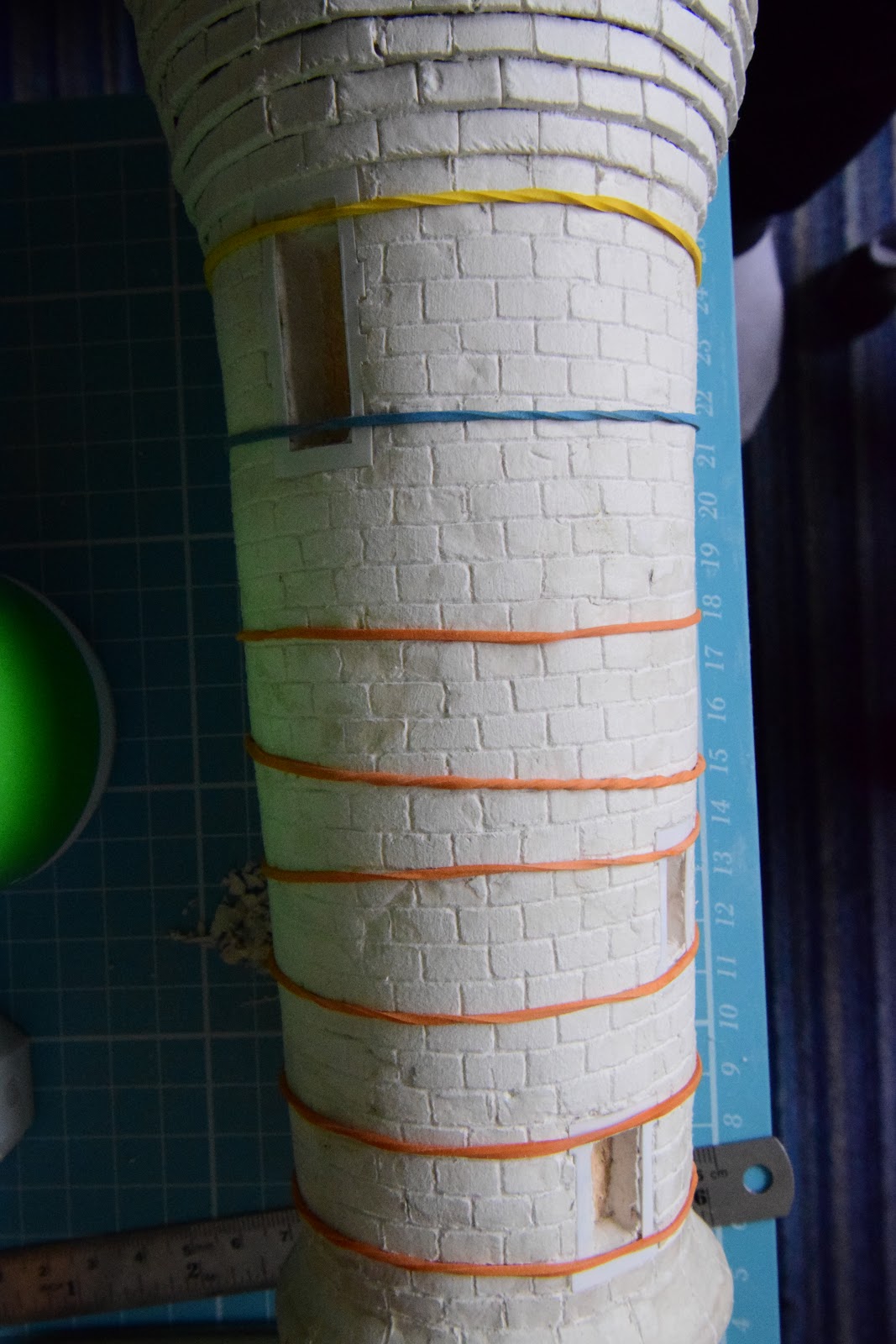
With the stone courses scribed (including the top of the tower, not shown), I turned my attention to fitting the stone window and door surrounds. Originally I planned to simply glue these in place on top of the stone work, but knowing how hard it would be to achieve a perfect finish, I opted for the trickier option (as always!). The frames were marked onto the tower, and careful use of the craft knife meant I could mark out the edges then slowly chip away at the clay:

With the door and 5 windows all cut out, the surrounds could be glued in place ready for the paint stage. In order to get them all to lay flat whilst the PVA dried, I used rubber bands to hold them all in place:
So, the painting. This turned out to be an incredibly long process (as with everything on this lighthouse!), but given my limited know-how, I think the end result is actually relatively decent. I'm afraid I won't be giving a blow-by-blow account of it; mainly because I have absolutely no idea what I was doing at the time. Painting isn't something I really know how to do, and matching colours to photos was incredibly difficult.
However, looking at the photo montage below; the first photo (left) shows a general undercoat of a mix of two Dulux tester pots - Perfectly Taupe, and Lemon Pie. These created a concrete-ish colour which I could use as a good starting point.
The middle photo shows the result of many many hours of painting variations of the same colour (mixed with a range of browns, whites, greys, and sand colours from Model Color). This is where the most experimentation took place, and where I found the greatest challenge in getting colours that were not so vastly different as to be out of place, but different enough to give some variation. In the end, some of the browns look a bit pink, and the dark greys look a bit blue (a common problem on this layout it seems!).
Finally, the last photo shows one of the various washes of colour I used afterwards to try and blend the colours together a bit better, and give some highlights and variation. The white here is the last one to go on (after a yellowish one, and has just been brushed on in the photo, awaiting immediate rubbing off with a kitchen roll to remove the worst of it. Judging by the prototype at Spurn, the close proximity to the sea creates a lot of salt deposits or something on the seaward side; hence this white streak.

With the main section of the tower done, I then applied a few washes of green to represent the abundance of seaweed found on base of the prototype. Given that the base is covered by water at high tide; this should come as no surprise. And so after many days of work, I've decided this is about as good as my limited skills will get it:

This lighthouse really is a labour of love, but I think it has been worth it; even if there is still a fair amount to do on it!
As a side note, I'm pleased to announce that Sandy Shores will be making it's 2nd ever outing. It is however a members-only event from the good people over on RMweb; but as I know a few of you here are also on RMweb then it's worth mentioning. The SWAG event will be held on April 28th at Staplegrove Village Hall, Taunton. Again, RMweb members only. With a to-do list for the layout as long as my arm, it's about time I made some serious progress...!
Comments
Post a Comment