...but believe it or not, I have finally forced myself to draw some plans... wait for it... to scale!
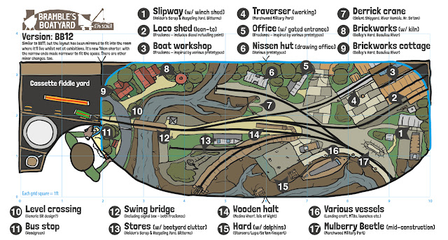
If you'd like a quick breakdown (TLDR), skip to the last plan - BB12. That is the plan that I'd like to move forward with. The next blog entry will explain it in more detail, and have a nice '3D' sketch waiting for you, too. Cheers!
Yes, crazy isn't it - from what has been, by this point, years of 'flights of fancy', to actual workable plans! I've always known almost all of my previous plans would be optimistic (that's the trouble with free-hand sketching), but I must admit I was still surprised by how big many of my previous layout plans would need to be in real life.
Truth be told, waaaay back in April 2021 (crikey!) I had layed out some old track onto the new studio floor and made a similar realisation with my very first design for Coastguard Creek. Even this layout would've been longer than anticipated, and the photo below still uses a bit of compression compared to what the plan should've looked like:
Above: The first plan for Coastguard Creek mocked up using old track from my childhood. Note that the length of the headshunt (top right) needed to shunt the boatyard (bottom left) means a lot of 'wasted' space - causing the layout to be 1ft or more longer than I would've liked. Apologies, by the way, for the terrible photo!
Clearly, doodling sketches is, whilst a fun pasttime, not conducive to workable layouts - for that, CAD and physical mock-ups are an absolute necessity. I'm sure I could've saved years by going straight to CAD! Most of the time (but not always) I was having so much fun during the research and sketching phase that it became a seemingly neverending circle of doodles.
So, allow me to get you up to speed with the past few months. As always, I've retrospectively added version numbers. In reality, there were more sketches (hence why this starts at no. 7 below - some of the early failed attempts were shown at the start ^). I've thus only shown the 'good' ones.
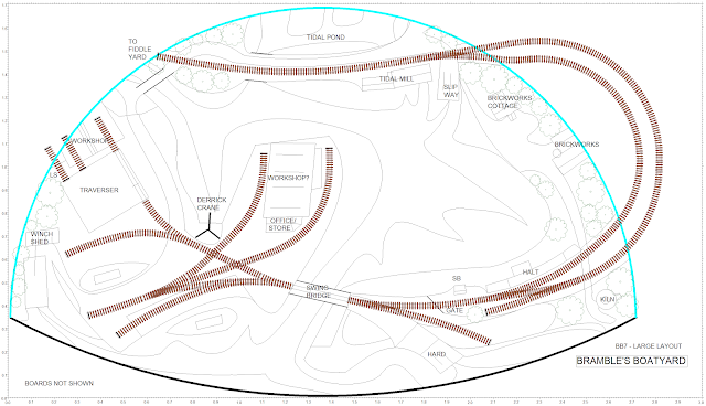
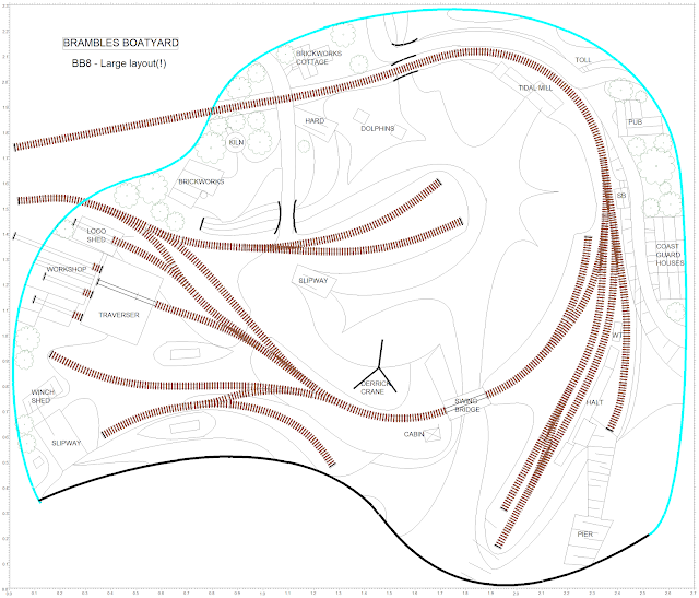
Note: BB7 and BB8 below have had XtrkCAD scale plans drawn just for this blog entry - to show how big they really were; they were not done at the time of sketching, so I had no idea of their feasibility (or lack of!) until now.
BB7
I mentioned in a recent RMweb status update that I had produced an unusually shaped layout plan that I thought, given my love of tea, may have therefore been a sign that I was onto something great(!). I can now reveal what I had come up with:
Above: BB7 is one of those layout ideas that I thought was the 'lightbulb moment'! Suddenly, a plan that encompasses all I wanted. I actually still like it a lot, but based on more recent designs, I think this would possibly require 3m x 2m of space (edit: close; it's 3m x 1.7m - see diagram below). I thought that the clever thing about the plan is that (apart from the fact that it's shaped like a teapot!) the rear line gives more 'run' for any passenger trains, and that the sharp curves that enable a 180 degree turn are off-scene. Note how this non-scenic section forms the station run-around, but that I didn't want it to have a point as that would require wiring - so the point is near the tide mill instead. (I've just noticed that I later scribbled a pub top left to hide the scenic exit, but forgot to alter the sketch properly - sorry!)
I liked this design so much that I actually did a 3D sketch:
Above: Note the overcast sky - as it's the run-up to D-Day, I felt that such a backscene would perhaps be more fitting?
Having spent about 7 hours learning how to use XtrkCAD (it has some quirks!), here it is in scale form (please ignore the rushed track geometry on the passing loop!):
Above: Like I said, it's certainly an interesting design that could work well if you had the space. You'd have to hope nothing derails towards the back of the layout, though! I have used radius 2 and 3 curves on the passing loop, and of course, I could go even tighter and go Radius 1 and 2 respectively; however, that is a bit too tight for locos like the Q1 which may make an appearance at times. All in all, I think it's a pleasing design, with some lovely curves and scope for setting the railway in the landscape. I do love the idea of a really deep layout with a one-piece curved backscene like this, but I've got no idea how I'd split it into manageable board sizes!
BB8
Here's another comparison of one of my latest designs - this is a design I came up with last week:
So, clearly things had to be scaled-down, and ambitions slightly quashed. As much as I'd love to, I don't have a dedicated railway room, and as it's unlikely I'll be moving out to a place of my own any decade soon (!). Compromise is, therefore, the name of the game...
BB9
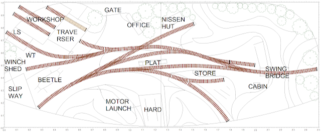
...I thus refocused on just the boatyard and swing bridge. My thought being that, one day, should I afford to get a place of my own, I can build an extension to the layout that includes all the bits I had to chop off (and more). Looking at the plans above made me realise that, actually, a 2.5m long layout, whilst quite large, is certainly achievable if split into two boards, and could potentially fit in the house for operating sessions. We just need to trim the width quite a bit! Thus BB9 was formed:
Above: It's quite a change from the previous plans! Whilst it is clearly smaller, it still has a lot going on.
The XtrkCAD version of this plan (which in itself is the 4th iteration - I made small changes to it throughout the evening) is a bit of a cheat because I did away with the angled top and settled for a straight back to give me more scenic room. This was certainly needed:
Clearly there are some differences between the two BB9 plans shown here, but every change has a good reason; for example, the hard has been relocated to the middle front - I wanted a leading line from the river up the slipway towards the platform and beyond. I also wasn't convinced there was enough room for the brickworks, so that didn't make it to the XtrkCAD plan. Note, however, that a small platform has appeared for the boatyard workers.
I'll explain more about the design philosophy of BB9, BB10, BB11, and BB12 in the next post; as they are all very similar.
BB10
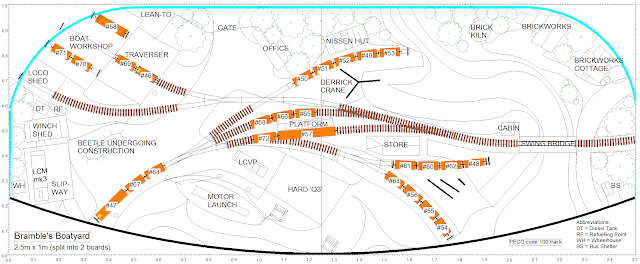
A few things to note;
- At the platform there is a Mk1 coach, and a CCT.
- The loco (#47, on the headshunt) is a Standard class 2MT 2-6-2.
- The loco on the traverser (#46) shunting the wagon is a class 02 (closest I could get to the tiny Ruston 48DS that will shunt it).
- All the other wagons are either short opens or 20' vans, except for the top road in the boat workshop which is a Lowmac (#58). Clearly the Lowmac won't fit on the traverser along with the loco, so that may cause an issue as it is likely to be the sort of wagon to use it! I may have to think up some sort of pushing device that I can activate for each of the workshop lines to push the wagons onto the traverser...
Above: As mentioned earlier, the XtrkCAD scale plan for BB10 was drawn before this sketch; with the latter drawn over the top of it. This means that this sketch is actually, for the first time ever, to scale; and is achievable!
I was going to leave it there, however...
BB11
...I felt it was important to try and improve slightly on BB10 by enlarging the traverser to allow a Ruston 48DS and a long wheelbase wagon (such as a Warflat, and other long flat wagons) to fit on it. The nearby Eastleigh Works was a hive of activity during WWII, which also featured such a traverser. This incredible footage from the Imperial War Museums website shows the shunting of various long-wheelbase wagons with landing craft and other vessels on top. The large Wagon Shop at Eastleigh was put to use building such craft, the IWM video shows some 25ft Fast Motor Boats, with the Carriage Works being delegated to construction of landing craft; like the LCS(M), as well as LCPs - also shown in the video. This website has more information and photos (including an equally fascinating second part accessed through the menu at the top). This should provide some very unusual and interesting wagon loads!
I have no idea what many of these wagons are (many, to my untrained eye, look like coach underframes/chassis), so any further information would be much appreciated if you can identify any of those shown.
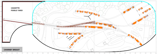
Anyway, onto the plan. Here's the XtrkCAD version:
Above: The difference from BB10 is quite simple; as mentioned, the traverser has been extended. That however has meant an additional point and flat crossing are needed to access the loco shed, and the line onto the traverser is now further back. A minor change is that the headshunt (bottom left) has been more or less straightened - the reason for this is because there was a nasty reverse curve leading from the topmost siding that goes near the nissen hut.
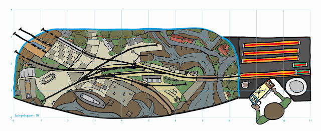
Above: And here it is in sketch form. Pretty self explanatory, I feel. You will however notice the inclusion of the fiddle yard. Let's look at this in a little more detail:
Fiddle yard
I'll admit I haven't put too much thought into this aspect of the new layout yet, but it probably is time to! I've shown a cassette fiddle yard for BB11; with separate cassettes for locos (green) and rolling stock (orange). These will have handles with some sort of simple arrangement to act as buffers on each end. The brown length next to the cassettes will be the guide to ensure they align with the scenic section properly, and I suspect I will use a system of metal sprung wipers that will make contact with copper clad strips on the cassettes - on the opposite side to the guide. This is just my early idea, though, so it may change.
Elsewhere, visible are the custom flat spots (with raised edges) for placing cups of tea and plates. Any exhibitor knows this is the most important aspect; to ensure that safe and adequate storage provision has been made for refreshments! A final thing to note is that the control panel has been purposefully angled - this is to allow better line of sight from the operator to both the layout and the public; so that conversation can be maintained more effectively whilst the layout is operated. Inspired by my computer monitor stand, one thing I've actually been considering is having the control panel on a movable arm that is clamped to the board; though this may be a bit overkill! Either way, some vertical storage shelves may be required at the back for the cassettes; we'll see.
Of course, there are plenty of other fiddle yard designs, and if you'd asked me what type I'd have chosen only a few years ago, I would've completely ruled out cassettes as I was a bit scared of the possibility of dropping them. However, having visited shows and other peoples' layouts where they have been used effectively, they seem very convenient - and all you need to prevent too much potential damage is to have plenty of flat space to move them around. I am however tempted to go back to my roots and make a traverser fiddle yard, but they are slightly less convenient in terms of running around trains.
Future modifications?
Food for thought, but I think this is trying to cram too much onto the layout!
BUT WAIT! There's one more!
BB12
Anyway, it's nice to have a plan that is technically feasible - and one that, actually, I think should provide plenty of interesting angles, operating maneouvres, animations, and generally convey a rural New Forest scene; albeit one set during a hive of wartime activity! The wagon loads should be quite unique, too.
Final thoughts
So, to finish off, I think it's worth reiterating that, whilst it's all well and good sketching to your heart's content, at some point (preferably as early as possible) you must either; use a CAD package, grab some old track, make a scale model, or find another way of making a trackplan to scale. The earlier in the process you do this, the quicker your planning will become, the less time is wasted, and any compromises will be made before you have a chance to become upset at the thought of not fitting everything in that you may want.
And as always, I repeat my mantra - Design for the space available; both in terms of storage/space to put up, and transportation. If you can't fit in everything you want, try to make scope for a layout extension (should you find more space in the future) or perhaps leave it for the next layout. You can of course just build one section or module at a time - which works well so long as you plan for this from the outset!
Just remember that you don't have to build the layout of your dreams straight away! A smaller project can be just as rewarding, and gets faster, more visible results.
Finally, what do you think of the plans (especially the final plan, BB12)? What do you like, what do you not like, and what could you suggest might improve things? I'd love to have some feedback; especially as I'm sure there is plenty I have not thought about!
NB:I will be drawing a 3D sketch of BB12 ready for the next entry, which will also discuss the philosophy behind the plan in a little bit more detail. It seemed more appropriate than another wall of text here, and besides, it would be nice to have one entry dedicated to the plan; not least because I feel it has real potential, and may even be the final plan*.
*subject to any refinements or future points raised by others!








Comments
Post a Comment